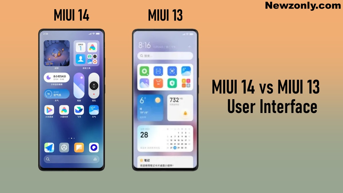
Since the MIUI 14 came into the market, made a huge impact on the users because it is more advance than MIUI 13. In this article, we will observe the difference between MIUI 13 and MIUI 14 user interface which is shared via RPRNA.
With MIUI 13, Xiaomi made many changes to the user interface but MIUI 14 take the whole thing to next level by bringing several advancements.

MIUI 14
With MIUI 14 users can easily customize their home screen by adding new Super Icons, larger folders, tabular icons, and Pet & Plant widgets. New wallpapers are also there to give the home screen a better look.
Xiaomi introduced a card-style design in MIUI 14 to present your information in a different way. It creates a Post in notes but it’s more organized. While using a large folder you can access the apps with just one click.
To avoid distractions, users can block the notifications of third-party apps with the help of notification settings. Some merger of the options has been done in the setting menu like VPN and hotspot has been added in connection & sharing.
MIUI 13
MIUI 13 initially offered new Dynamic wallpapers, widgets, and new font MiSans. Dynamic wallpapers create a flower-blooming effect from one side of the screen when the device is turned on.
While adding the MiSans font in MIUI 13 creates a cleaner look because these fonts are more symmetrical and the space between them is good. It improves the overall appearance of the interface. It’s good for users who like to read using their phones.
