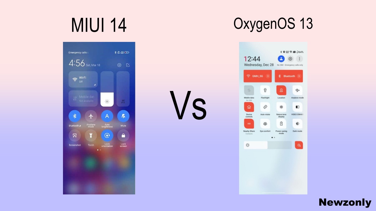
MIUI 14 made a huge impact on the market. Users wanted to know how innovative is MIUI 14 as compared to the custom skin present in the market. ln this article, we will take a look at the Quick Settings Panel of MIUI 14 and OnePlus OxygenOS 13 which is shared via RPRNA.
Both User interface is very popular with their fans. Companies made them simple and easy to operate. But if go deep then we will find a wide difference in their appearance and way of presentation.

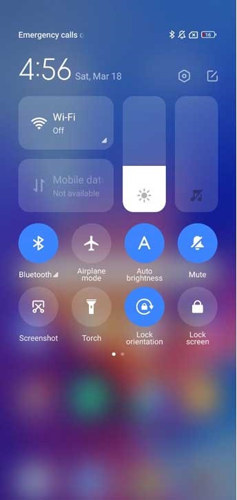
MIUI 14
On the top left you will find the Clock and date beside him, coming down there is WiFi and mobile data. Brightness and volume bar on the right side. Below these options are other useful functions like Bluetooth, airplane mode, torch, etc. MIUI 14 provides two windows for these function buttons.

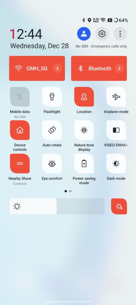
OxygenOS 13
On the top left you will find the Clock and date below him. Then WiFi and Bluetooth options are adjacent to each other. Then other options like mobile data, flashlight, location, airplane, etc are located under. OxygenOS 13 provides two windows for these functions.

Quick Settings of MIUI 14 uses translucent background while OxygenOS 13 uses a sky blue colored background. You can change the color theme in OxygenOS but not in MIUI 14.
For the same function, both used a different name. They include almost all the functions but the location of these functions are different. It’s all about who used to use which module.
