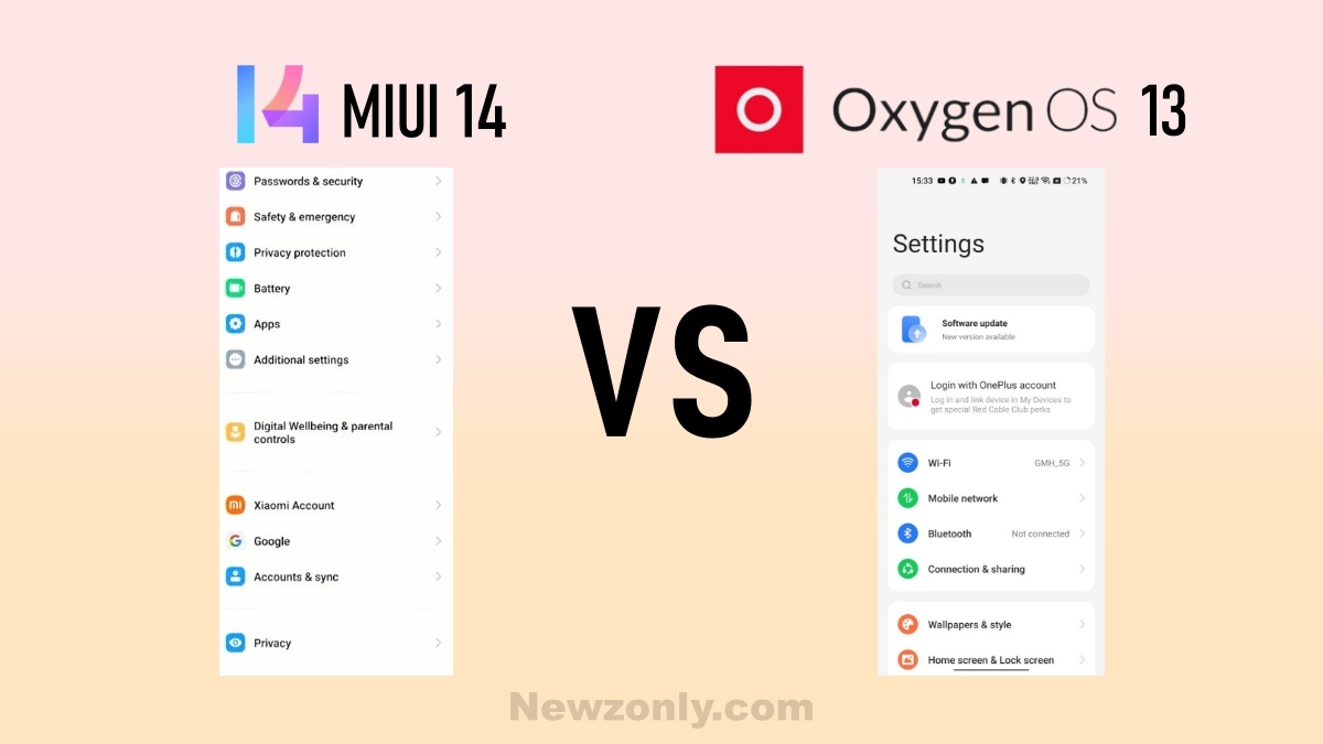
In this article, we are comparing the Settings Menu interface of Xiaomi MIUI 14 and OnePIus OxygenOS 13 which is shared via RPRNA. Both are China-based Companies and have a huge fan base.
Whenever a new thing came into the market fans started talking about them. Most users wanted to know the difference between MIUI 14 and OxygenOS 13. But some users are more interested in comparison.

MIUI 14
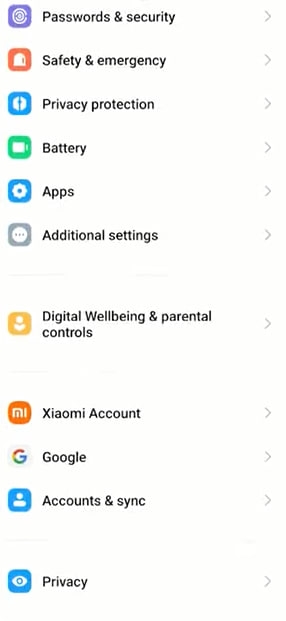
Settings Ul is inspired by MIUI 13. This time some of the options come under the same name like portable hotspot merged in connection & sharing. Bold and bigger icons are used for a cleaner look.

Now MIUI 14 is more smooth while operating. The search bar is more effective. Cornorred square icons are used. On the top About phone option is located and another phone-related option. Partition lines are used to separate the option.
OxygenOS 13
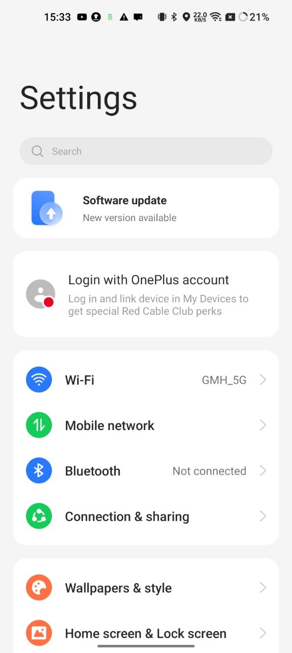
At first look, this Ul look more attractive. Circular and bold icons were used for a clear view. Same as MIUI 14, on the top phone related options are available. Its option list is more organized.

To separate the options separate card windows are used. As compared to MIUI 14, OxygenOS 13 is less Colourful. The combination of font and icons is good. Both the Ul are liked by their fans.
